OREANTHI TEA PACKAGING REDESIGN
case study | AKTO 2018
Project requirements: research, process, mock-ups, final 3D construction.
➡ PDF presentation on ISSUU
RESEARCH - IDEA - DEVELOPMENT
Values:
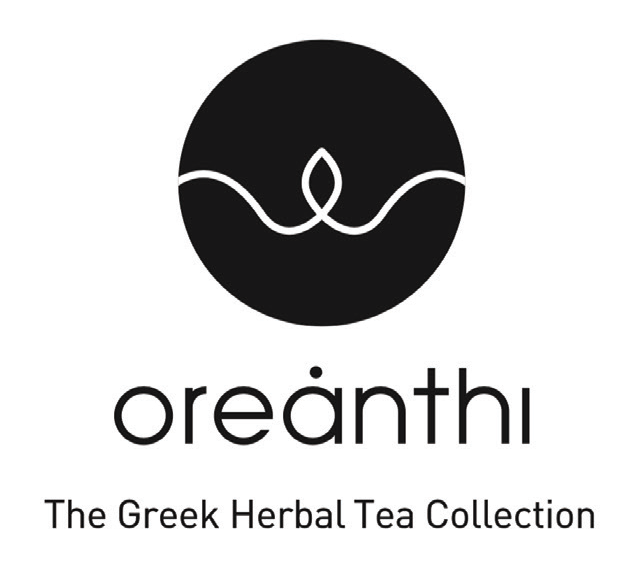
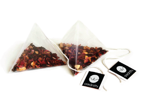
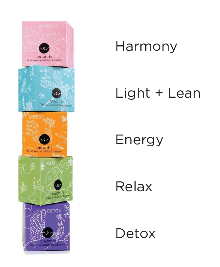
The name Oreanthi means 'beautiful flowers' and it is a company founded in Greece by 3 women during a time of financial crisis. OREANTHI is a herbal product made with whole leaf herbs combined with flowers and helps stamina through 5 different tea flavours. Brand values are purity, creativity and a combination of tradition with innovation. It is aimed at consumers who are not satisfied with the products of the supermarket shelf, while most of the suppliers are Greek. The existing Oreanthi package is a small square box of different color per flavor containing 15 tea pyramids and decorated with simple white line illustrations which derive from traditional embroidery.
Concept:
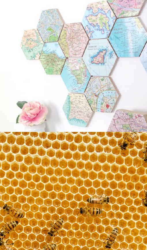
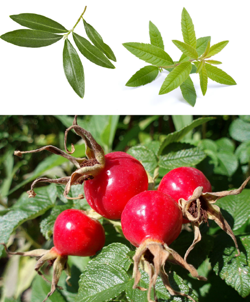
I wanted to retain the modern style that results from the brand's carefully designed aesthetics. After researching I decided to modify the packaging to a hexa-box (hexagon lid), open up the colorscape to a wider range and also adapt my own motifs on the graphic elements, drawing on herbals found in the tea as inspiration. The six-sided choice was made on the basis of usability regarding the boxes' placement and the assembly of many units together, as well as the fact that it looks impressive, acquiring a more collectible value for its owner. Around these lines, I researched similar products as well as looked at the work of artists related to the ornamental part.
Packaging development:
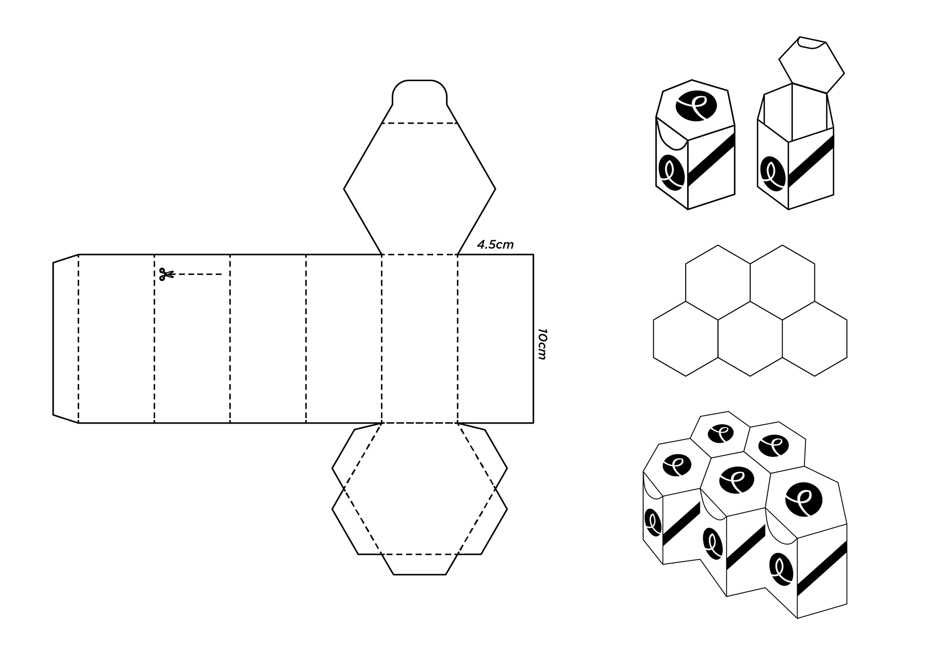
Skeleton - Tags:
Color palette:
Final proposal:
Final 3D product:
Thank you for viewing!